HOW TO MAKE USEFUL EXPENSE CHARTS IN GOOGLE SHEETS
In part one I showed you how to create a simple way to track your expenses.
In this part I am going to show you how you can make some sexi, beautiful and useful charts. One of the chart we would like to see is how much money we spent on a given categories (present in the form - transport, free time, restaurants etc.)
Table of content:
Simple chart (barchart)
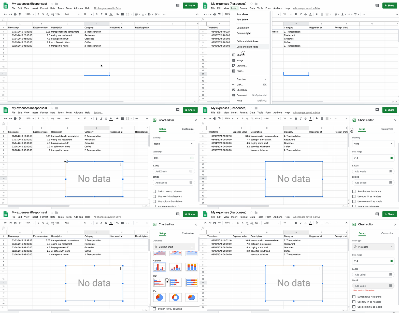
If you haven’t created your response sheet yet, I highly recommend to read the first part. This sheet is generated through Forms responses section. However, if you have another source of data imported to the sheet, you can skip the first part. Open your sheet file and insert a blank chart. Next you have to choose the type of the chart. For this type of data we choose Pie chart to see simply proportions where your money goes the most time.
See gif below.
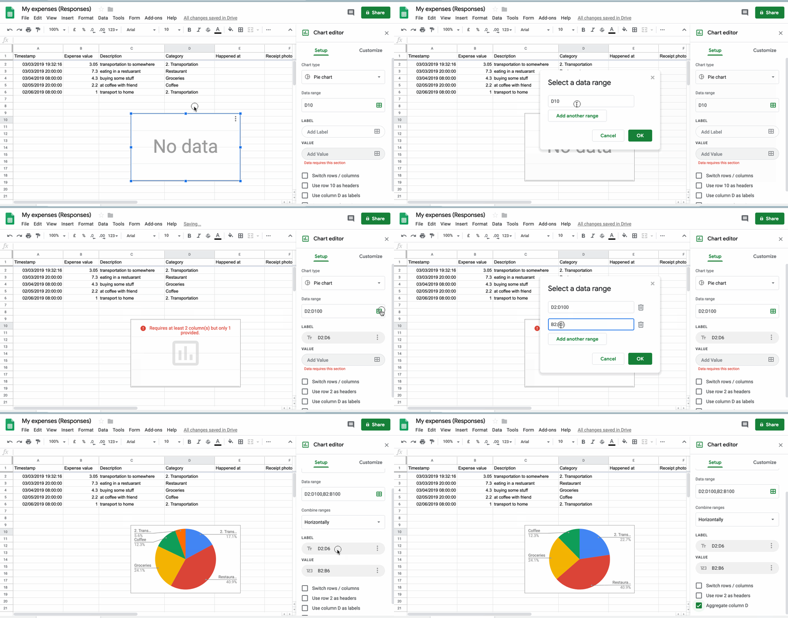
Now choose the data ranges. Labels and values. First you need to specify data range. In this case, you need to choose two columns, B to the end - which is value, and D which is type -> label. We set the B2:B100 to cover 100 next data rows in the table, and D2:D100. We also aggregate all values by value D. Aggregation is the sum of the values by the same label naming. In this case, you can see that Transportation in the Pie diagram will be summed up. For next types of charts and views you gonna need some more information about aggregation - read further.
Advanced types of charts
Let’s say you want to know how much money you spent in the given month or year. For this type of data we choose another approach. Google Sheet allow write QUERY for some range of data. QUERY is very similar to the SQL. If you have never heard about SQL, please google it. Basically it is query language to get, update or delete some data. In this case, however we are going to select (get) data.
Warning: Google Sheet QUERY doesn’t have “FROM” clause.
For more information see this
To see syntax of Google Sheet Query Language see this
=QUERY(
   data,
   query,
   headers
)- data [Range]: Range of your data from sheet where the query will operate on.
- query [String]: Your query
- headers [Number]: Optional, the number of rows under the actual row where the function inserts the result of your query
If you are programmer, from now you probably know how to continue further. If you are normal person, you have probably no clue what I am talking about. You can ask, why I am explaining things about query function. Well, that’s because we need to transform the data a little bit. Let’s say we want to know how much money you spent over last months, or how money items (transaction) have you done through past months. Now you can’t just select some columns, create chart and you done - you are not done (like in the section described above), because you don’t have right data to create this type of charts.
Aggregation
Imagine aggregation as throwing items to the buckets. Every bucket has a label (or name) and it’s inner value. When you make aggregation, you also grouping your data with some function. The most popular aggregation functions are SUM, COUNT, AVG, MAX, MIN. When you throw an item to the bucket, the aggregation function is used on the item in the context of bucket where the item was assigned/thrown. Name of the function should actually tell you what it is supposed to do. If not, look at the reference here. Then, you iterate over your specified data and search for specific value. If this value is the naming of your bucket, throw this iterated row into the bucket. In real-world example, the specific value is SELECT name GROUP BY specific_value. Now if you find next row with the same value you throw it to the same bucket again. Okay, now you finished iterating over the rows and you have bunch of buckets with a rows in it.
Let’s say you have a car shop. You sell several brands of cars (Toyota, BMW, …). You’ve got records of your sold cars - time, car brand, and the price you have sold the car. Now you want to know the total count of every sold brand.
Like so: Toyota - 15 cars, BMW - 8 cars, …
| brand | count |
|---|---|
| Toyota | 15 |
| BMW | 8 |
The query for these type of problem would look like this:
SELECT brand, COUNT(*) FROM database GROUP BY brand
Or you want total money purchased for the sold cars - you can do it because you saved the price in your database.
| brand | sum |
|---|---|
| Toyota | 89325 |
| BMW | 124140 |
The query would look like this
SELECT brand, SUM(*) FROM database GROUP BY brand
If you look closer, only aggregation function changed from the previous query. Because bucket throwing mechanism remains the same, the final aggregation function is different.
If you still have problems with understanding aggregation, see this link
You need another column
I told you we are going to calculate our expenses over the past months so I suppose you imagine the result table (from which we create our final chart) somehow like this:
| Month | Sum |
|---|---|
| Jan 2018 | 150 |
| Feb 2018 | 370 |
| Mar 2018 | 210 |
| … | … |
Now we are running into a few problems:
-
We don’t have function, which returns format of the date like shown in the table above. (Now we have date like this = 03/03/2019 19:32:16)
- Solution: We can extract Month and Year from that field.
-
Another problem is we don’t have name of that extracted month, but rather number of month from the beginning of the year.
- Solution: See below
There is no function for which returns you the name of the month based on a number. The solution is you define month names by yourself then you can reference to this namings with some value. So what you do is extract number of month from date and then look for the cell on the specified index (specified by month value).
For example “2018-07-14T15:00:00.00Z”. Extracted month value would by 7. Then you feed this number to your function and get 7th row in which we have Jul. Now the INDEX function helps - you select column of your defined month names.
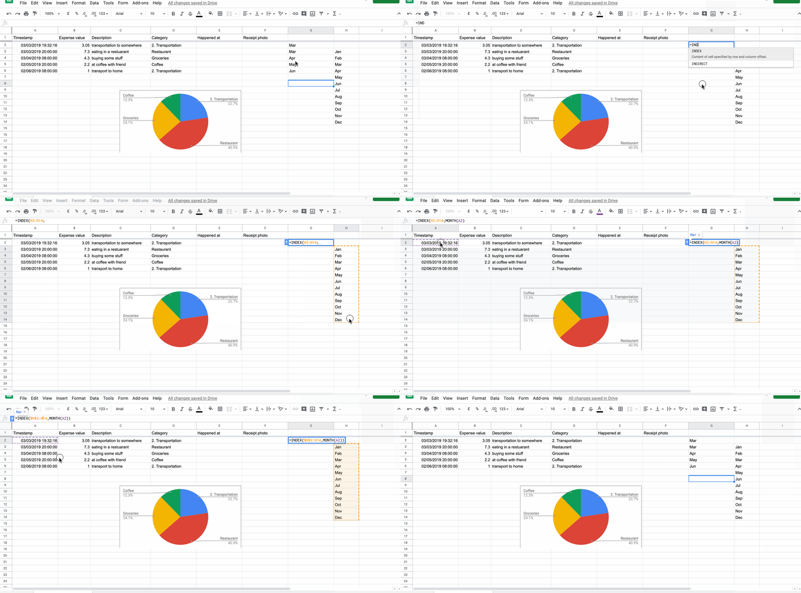
Note: $ sign before column and row is useful when you apply your formula on the other rows and you don’t want another formula values/ranges to slide - our defined month names are rock static and don’t slide :).
For the consistency I would create another sheet named Constants and move the month namings there. If you didn’t know you can refer to the data in another sheets (bottom panel).
The next step is to extract the Year from the timestamp.
=YEAR(A1)
Now we have two more columns with month name and year. Now we want to concatenate these two values into one column.
Note: We could do the whole process within one formula, but for the sake of simplicity I chose this approach.
In the third column, write
=CONCAT(CONCAT(month_cell;" "); year_cell)
replace “month_cell” and “year_cell” with your cells and slide the formula down to all rows.
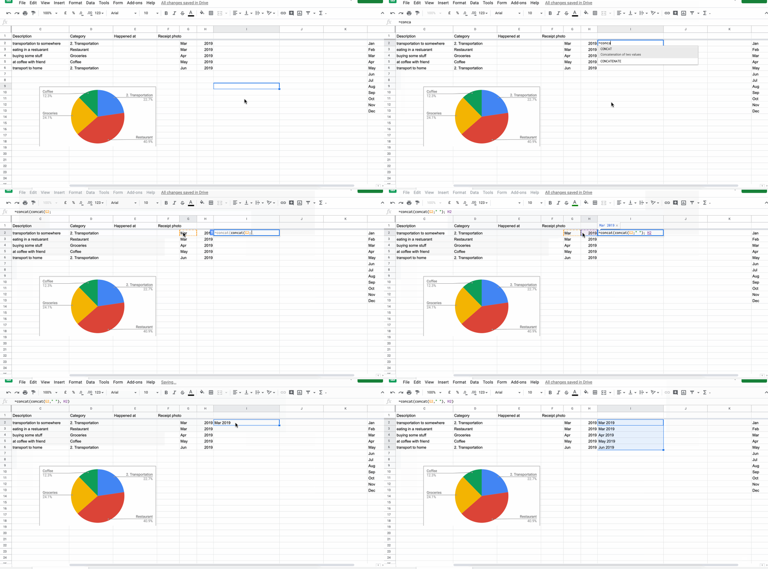
Cool! now we have our label completed (bucket name for aggregation) and value (expense) in the second column. Time to make our first query
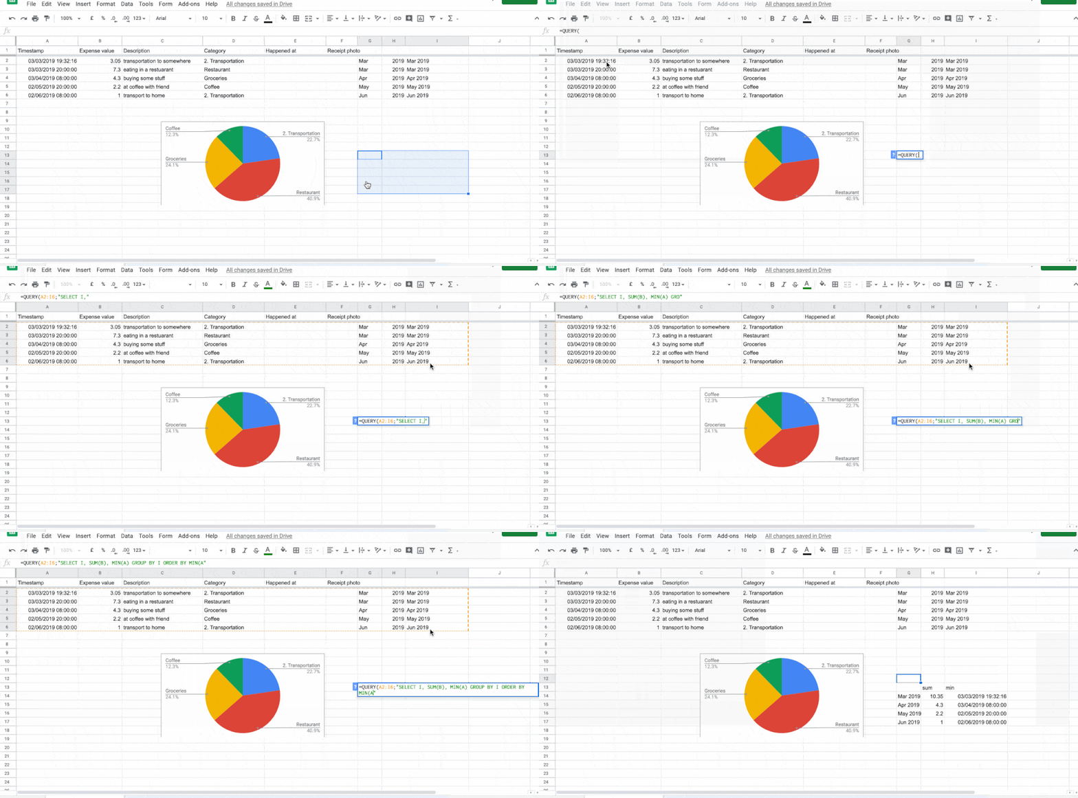
Select the cell where you write a query. After execution of the function, this cell will be top left corner of your new table (after query). For this time, you can select the sheet where you have your raw data but I highly recommend to not mix raw data, constants and charts into one sheet. First argument of the QUERY function is range of data which the query will operate on. In this case you want to select all columns from start to the end (end column is the column with concatenated month name and year).
The next argument is query. This is the most tricky part, as the query will aggregate your data, it knows nothing about how the result rows should be ordered - and you want your result rows nicely sorted (Jan 2018, Feb 2018, Mar 2018 …).
query = SELECT I, SUM(B), MIN(A) GROUP BY I ORDER BY MIN(A)
Breath in, breath out. This query will do the work. First we selected Column I where is our “Mar 2018” values saved. The next is SUM(B), this is aggregation function over grouped bucket (same month). The next selected column is MIN(A), this is tricky one - we want to select “some” datetime value from the bucket (month). But we need to tell the query which one row to choose (as soon as the query doesn’t know) - this value tells us how we have to sort the result set. GROUP BY is basically bucketing - it groups all rows into group with the same value I. So every row inside group has the same value. ORDER BY MIN(A) is ordering function - it orders the final result of the query by MIN(A) which is minimum date in every group.
Final step, show me the chart!
Okay. Now you can choose your chart (barchart), select ranges from result query and you got it.
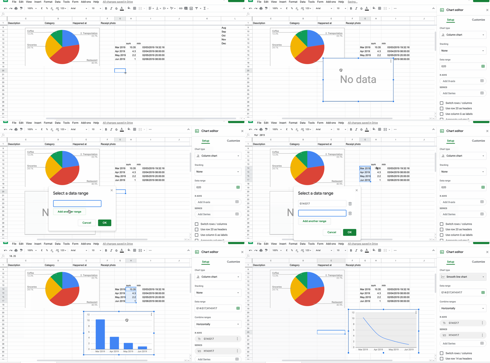
And you got it. Your last months and expenses for these months :). I believe from now on you can play with these tools a little bit, customize the charts for your needs. In next section I am going to name some other types of queries you should consider to implement ;)
Another types of charts and views
- Show hours of a day and sum of your money spent in the hour.
- Show hours of a day and count of transactions in the hour.
- Show me week (throughout whole dataset) and show me the days in a week and how much did you spend.
- Show me week, days in a week and count of transactions.
- Weeks in a year…(1..52)
- Days in a month (1..31)
- … You are creative, you can create one by yourself.
Conclusion
I showed you how to make simple and advanced view and how to query your data. If you have any question, please comment below! If you see any imperfection (Nobody is perfect), please let me know in the comments and I can edit the text later - I give you credit :)
The Google Sheet has thousands of functions, a lot of which I haven’t even used yet - try to play around a little bit and have fun! Thank you for being here.
You may also like
Simple Tracking Expenses with Google Sheets and Forms
Motivation If you are not interested in the story about my unsuccessful start jump here As a student, self-financing person I had a lot of…
How Should One Cut His Forest In Order to Last Him Forever
This is Jack. Jack is a man living in a cabin inside a small forest. He knows how to cut trees and how to take care of his small cabin. He…
So I've got Master's degree - Is the college really worth it?
Prepare yourself, chill out and read it happily while sipping out of your favorite tea or coffee. Don’t take the post too seriously but also…
